~ ~ ~ ~ File = 2.html - Flatley theme ~ ~ ~ ~
GDH2 Comment - I built this web site to illustrate how a single web site can be designed to work well on any size screen, from phone to desktop. I am using a new web design system called "Bootstrap" - labs from my class are at the end of this page.

What size is your screen right now?

The web site layout changes automatically when you drag the browser window width smaller or larger. I created the ruler - it is approximate & starts at 15 (there are 15 pixels of padding on both sides.

Official sizes are LARGE (1200+), MEDIUM (992+), SMALL (768+), X-SMALL (768-)

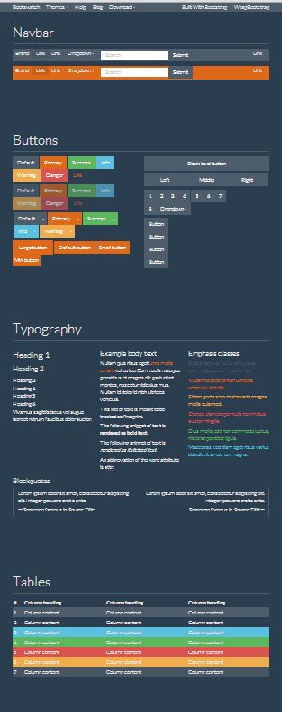
LARGE SCREEN - Desktop or Large Laptop

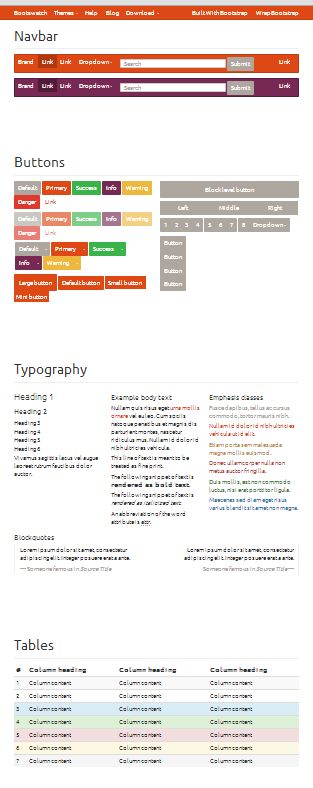
MEDIUM SCREEN- Small Laptop, Large Tablet

SMALL SCREEN- Small Table, Big Phone

X SMALL SCREEN - Phone

Pixel Ruler

GDH2 Comment - Sample web site starts below - Test D1 - This is "panel-danger" format (there are 7 others)

GDH2 Comment - The above "navigation bar" is common because it adapts well to the small displays. The "navbar" automatically becomes 2 lines if it will not fit on 1 line and is replaced by a navigation icon (aka a "hamburger") in the top right corner when the screen is EXTRA SMALL (mobile device).

Title = Hello, world!

Pre-formatted page "title" style. There are many themes with different looks. test test2

Panel danger

Panel "body" style = Panels can create a nicely framed box.

In some themes the stylistic differences between different panels is large, in others they are identical. Most themes use a heading (h3) for all the panels except body, and in some themes "h3" is very large, so modified my "danger-panel" comments to not use "h3".

The inside can contain text, links, images, buttons, and special formatting.

Gobbledygook text is used for filler - Cras justo odio, dapibus ac facilisis in, egestas eget quam. Donec id elit non mi porta gravida at eget metus. Nullam id dolor id nibh ultricies vehicula ut id elit. >Cras justo odio, dapibus ac facilisis in, egestas eget quam. Donec id elit non mi porta gravida at eget metus.

Panel info

Panel success

Panel warning

Panel primary

Your screen is LARGE - Desktop or Large Laptop

Your screen is MEDIUM - Small Laptop, Large Tablet

Your screen is SMALL - Small Table, Big Phone

Your screen is X SMALL - Phone


GDH2 Comment - Thumbnail Boxes - just another style that's easy to use
300x200

Thumbnail - People

The images here are random images. They will probably change if you hit screen refresh! Who knew there would be a domain dedicated to generating random images for sample web sites?

Meet Someone Call Shrink

300x200

This label for a city

Cras justo odio, dapibus ac facilisis in, egestas eget quam. Donec id elit non mi porta gravida at eget metus. Nullam id dolor id nibh ultricies vehicula ut id elit.

Fly Drive Walk

300x200

Sports Thumbnail

Cras justo odio, dapibus ac facilisis in, egestas eget quam. Donec id elit non mi porta gravida at eget metus. Nullam id dolor id nibh ultricies vehicula ut id elit. Nullam id dolor id nibh ultricies vehicula ut id elit. Nullam id dolor id nibh ultricies vehicula ut id elit.

Go to Gym I'm too Lazy!

GDH2 Comment - Multiple Columns - 2 Columns are divided into additional columns. There is no limit to "nesting" rows and columns.

Easier Design & Maintenance

It is truly remarkable that Bootstrap gives the coder the tools to make one web design that will work on the myriad different screen sizes. It used to be that the small mobile phone screens required a completely different address and it's own code.

The coder would need to go to multiple pages and try to make identical changes to correct an error, change design, add something, whatever.

This is HUGE!


Note: The rules in this example apply ONLY to Large & Medium screens. The layout will display each of these columns across the whole screen when the screen is Small or X Small. Otherwise it all would be too squished to be readable. It is possible to have these rules apply to SMALL screens, just not practical.

Example

This column is defined as 4/12 of the available space. The column to the right is 8/12 wide.

Let's break this column (4/12 wide) down further, even though it's impractical.

View details ยป


Col 2

This is 2/12 of space.

Column 4

This column is defined as 4/12 of the available space.

Column 6

This column is defined as 6/12 of the available space. Any column can be further divided, so let's do it.


Col 4

This is 4/12 of available space.

Column 8

This is defined as 8/12 of the available space.

Random Sports Image 100 pixels wide

Style Flexibility

Change one "Theme" file to completely change the look of the site!

The code describes the content and the basic layout but the "style" is independent.

Sample themes can be viewed at BootSwatch (this link does work). The differences can be spectacular!

SuperHero Theme

SuperHero

United Theme

United

GDH2 Comment - Multiple columns with same rules for ALL screen sizes = absolutely identical appearance for Large & Medium screens. But at Small & X Small, the text is hard to read because of line-breaks and the graphics are truncated and almost illegible. I think this a good example of the advantages of different rules for different size screens. Drag the screen to extra small - note text readability, examine the images.

USING RULES SAME FOR ALL SIZES OF SCREENS

Note: The rules in this example apply ALL SIZES of screens. Does it seem practical to you?. I decreased some of text.

This column is defined as 4/12 of the available space. The column to the right is 8/12 wide.


Col 2

This is 2/12 of space.

Column 4

This column is defined as 4/12 of the available space.

Column 6

This column is defined as 6/12 of the available space. Any column can be further divided, so let's do it.


Col 4

This is 4/12 of available space.

Column 8

This is defined as 8/12 of the available space.

Random Sports Image 100 pixels wide

Style Flexibility

Change one "Theme" file to completely change the look of the site!

The code describes the content and the basic layout but the "style" is independent.

Sample themes can be viewed at BootSwatch (this link does work). The differences can be spectacular!

SuperHero Theme

SuperHero

United Theme

United

Your screen is LARGE - Desktop or Large Laptop

Your screen is MEDIUM - Small Laptop, Large Tablet

Your screen is SMALL - Small Table, Big Phone

Your screen is X SMALL - Phone

Image Sizing Example

Automatic Image Sizing

(drag screen larger or smaller)

Full Size 1280
50% Size 640w
33% Size 426w
25% Size 320w

Paradise Trail at Mad River Glen (text-size=125%)

Your screen is LARGE - Desktop or Large Laptop

Your screen is MEDIUM - Small Laptop, Large Tablet

Your screen is SMALL - Small Table, Big Phone

Your screen is X SMALL - Phone

Bootstrap Class - Lab #1

Bootstrap Class Lab #1 - G Douglas Hobkirk II


Music Store

Album Title

Artist

This is what the final solution should look like. The coloring will be different based on the theme you select. This is what the final solution should look like. The coloring will be different based on the theme you select. This is what the final solution should look like. The coloring will be different based on the theme you select.

End of Bootstrap Class Lab #1