Looking Great on Desktop or Mobile Screen
View on Desktop Screen
Trickery
The "Controlled" images do not match because a different image (and message and its background color) was specified for different width screens. More details below in "Images".
Read on! Details of the magic follow...
"Introductory" details (i.e., lots of words) are at the bottom - Web Development and GDH2 Layout.
View on Smart Phone
Panels
Panel Heading
Panel Body
Panels...
...create a nicely framed box that can contain virtually anything and be internally formatted. They automatically add:
- Rounded (slightly) corners and a frame around the edge of panels
- The body frame color matches the header panel
- A small (about 1 text line high) "shadow panel" is added to the bottom
- Each panel adds "padding" (extra space) around the contents of the panel.
Types of Panels
- Heading (sets the color for itself and the border that includes any connected panels)
- Body
- Footer
"Class Styles"
Each Theme has 5-8 different "styles" with different colors and fonts, especially "panel-heading" font (see "success" panel below for more).
There will be many more example where these same "class styles" are used.
Nested panels
Magnificent! This panel and all the other examples are contained inside one panel.
Panels can be formatted, including rows and columns
This panel has multiple columns, the panel examples below have rows and columns.
Panels do not "pack" content
The "padding" that makes panel look so good hurts density.
Panel "footer" Style
Panel "info" Style (this is an unmodified "panel-title" which shows as a H3 [pretty large])
- The "panel-title" formatting trumps most manually coded formatting
Panel Headings
Each theme defines the "panel-heading" font type, including color and size. As far as I can discover, this can only be changed 3 ways:
- Don't use "panel-title" and use "h4" (or whatever) (see Panel "success")
- It increases the top margin
- Using in-line text modifiers, like "strong" and/or "italic" (see Panel "warning")
- Overriding the font size (see Panel "danger")
- Modifying the CSS files
Potential problem:
- Some themes might use "panel-title" in a way you love.
Panel "success" Style (eschewing "panel-title" - this is H4)
Panel "warning" Style ("strong" + "italic")
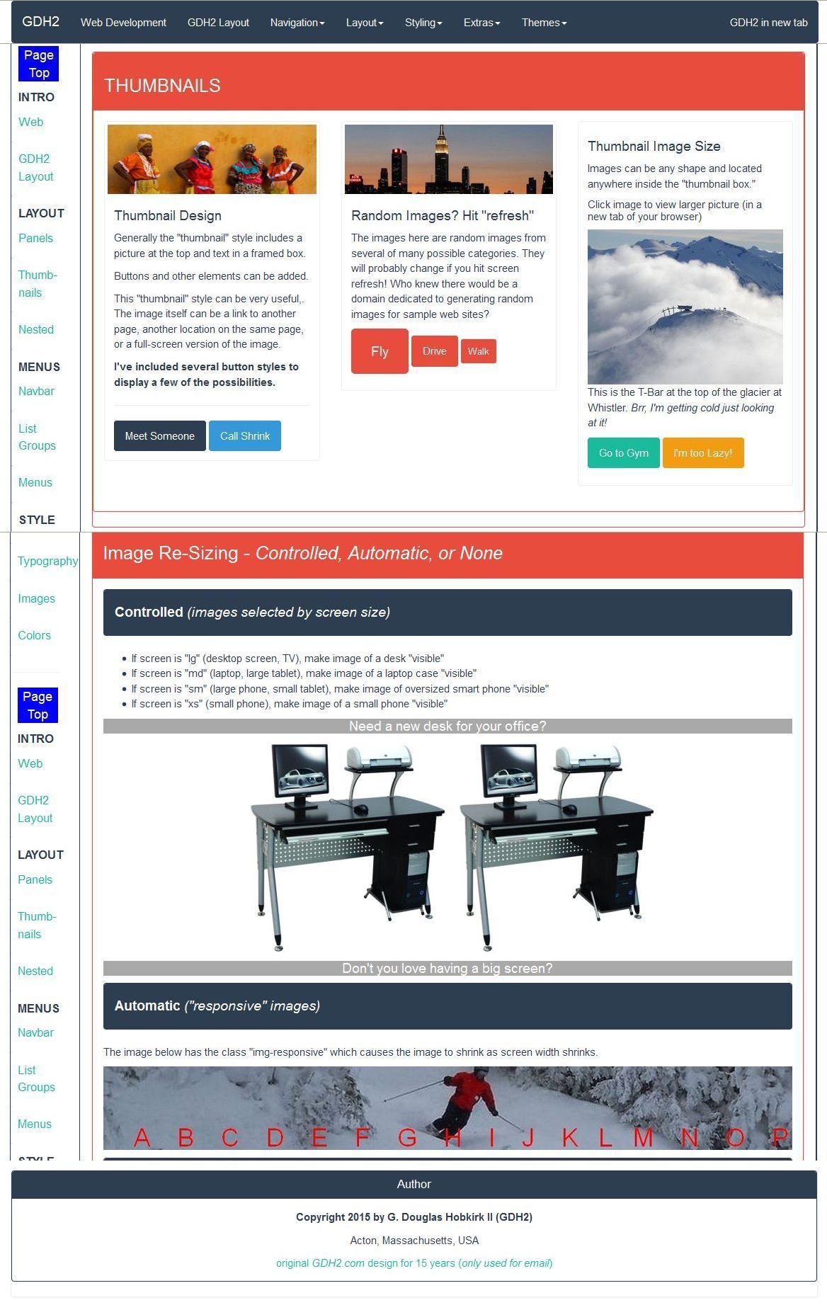
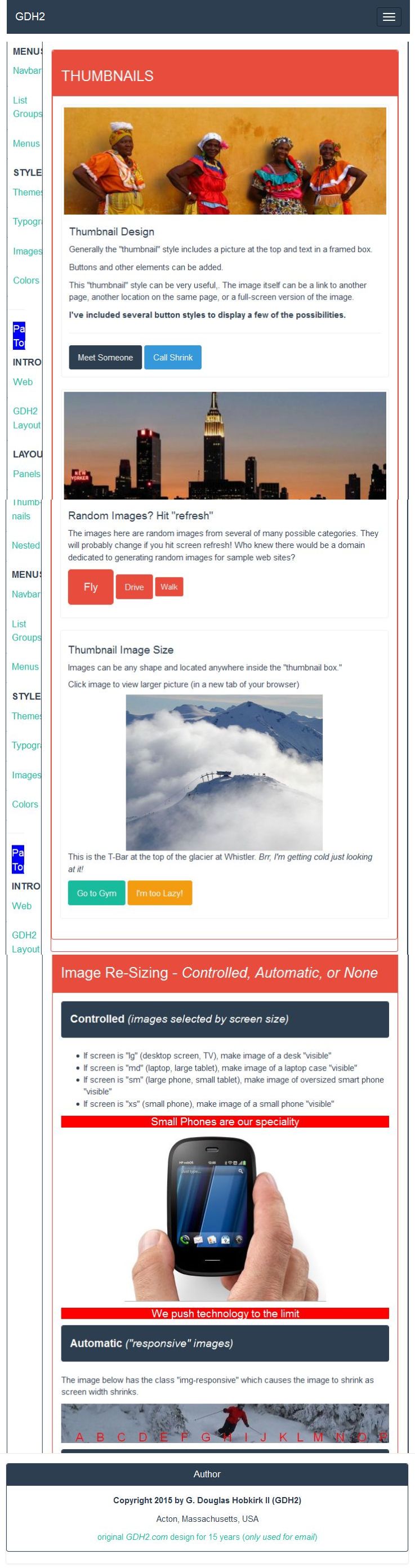
THUMBNAILS
Thumbnail Design
Generally the "thumbnail" style includes a picture at the top and text in a framed box.
Buttons and other elements can be added.
This "thumbnail" style can be very useful,. The image itself can be a link to another page, another location on the same page, or a full-screen version of the image.
I've included several button styles to display a few of the possibilities.
Meet Someone Call Shrink
Thumbnail Image Size
Images can be any shape and located anywhere inside the "thumbnail box."
Click image to view larger picture (in a new tab of your browser)

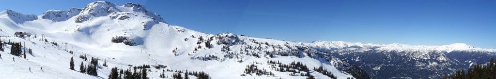
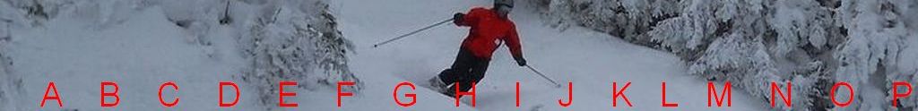
This is the T-Bar at the top of the glacier at Whistler. Brr, I'm getting cold just looking at it!
Much of the message is how the page adapts to different widths
your screen is LARGE (Desktop, Large Laptop, TV)← drag edges to change size →
Much of the message is how the page adapts to different widths
your screen is MEDIUM (Laptop, Large Tablet) ← drag edges to change size →
Much of this is how page adapts to different widths
your screen is SMALL (Small Tablet, Big Phone) ← drag edges to change size →
This is about how page adapts to different widths
your screen is X SMALL (small Phone) ← drag edges to change size →

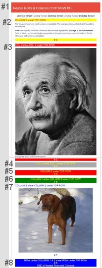
Nested Rows & Columns (TOP ROW #1)
Desktop Screen Desktop Screen Desktop Screen Desktop Screen Desktop Screen
COLUMN 1 under TOP ROW
The viewing problem on small screens is readability. The examples below will illustrate the problem, and the cure.
Note: The rules for rows and columns in this example apply ONLY to Large & Medium screens. Each of these columns will display sequentially at full-width when the screen is Small or X Small. Otherwise it all would be unreadable.
# 2
COL 1 under COL 1 under TOP ROW
Images are larger on the small screen.
# 3
COL 2 under COL 1 under TOP ROW
# 4
COLUMN 2 under TOP ROW
# 5
COLUMN 1 under COLUMN 2 under TOP ROW
# 6
COLUMN 2 under COLUMN 2 under TOP ROW

# 7
ROW under COLUMNS 1 & 2 under ROW under TOP ROW
# 8
END of Nested Rows and Columns
Same content on an XS (extra small) screen...
Phone screens have higher pixel density (iPhone6 = 326dpi) than typical desktop screens (19" = 86dpi) used for screen capture, so the size is reduced to 25% - insufficient definition, but correct proportion .
Albert is larger - that's ironic!
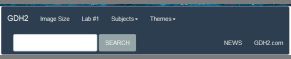
Collapsible Navbar ("navigation bar" at top of page)
The "collapsible navbar" is one of greatest Bootstrap components.
How can many menu links and options be shown without being unreadable on a small screen?
Screenshots showing menu ("navbar") because it adapts well to the small displays. The "navbar" automatically adapts to larger/smaller screen width:
-
Only 1 "line" is used if the screen is wide enough to display everything - Everything is easy to read

-
Simply shrinking everything to fit on a narrow screen would not work - Impossible to read

-
If the screen too narrow for that, 2 lines display everything - Everything is easy to read
-
If the screen too narrow for that, the bar collapses to one line and a navigation icon (aka a "hamburger") appears in the top right corner. EASY to read, but "EVERYTHING" is 1 click away
Very clever!
Technical note: The collapsible navbar is very "fiddly" - the one above takes almost 100 lines of code, much of which is unique to the navbar.
List Groups Simple "tables" for Unordered Lists ("ul")
Basic
- First Item
- 2nd Item on List
- Bullet List Alternative
Classes
Same "Classes" are also used in panels, buttons, background color, etc.
- First item (info")
- Second item (primary)
- (success)
- Third item (warning)
- Fourth item (danger)
- Fifth (success)
Custom Content
1st Heading (active LINK)
Heading Code = (div class="list-group" / a href="#" class="list-group-item active")
Text Code = (p class="list-group-item-text")
2nd Item (LINK, following text box not required)
3rd Item (GRAY = disabled LINK)
Observe Mouse Pointer when it hovers over
4th Item (NOT LINK)
"Boxes" can be formatted (somewhat) and contain "stuff"
Dropdown Menu Examples
Dropdown or Drop UP Menus
All dropdown menus toggle (click open, click close). Note "extras":
- embedded headings
- spacer line
- disabled choice
Dropdown (the "box", not menu "button") as far right as possible
Dropdown Menu can be located anywhere
The "class style" of the "button" can also be changed
Glyphicons Improve Menus
What are "Glyphicons"?
From the source, Glyphicons.com: "Glyphicons" are "a library of precisely prepared monochromatic icons and symbols, created with an emphasis on simplicity and easy orientation." They are primarily used in toolbars and navigation bars.
Glyphicon Examples
There are 600 basic Glyphicons. Here are a few random favorites:
Many can be full or empty - like star
and heart
Some icons are erratic: do you see "car" "cars" "taxi" "bicycle"?
(I don't)
← → ↓ ↑ are HTML supported but not (for me) as "left-arrow" etc.
But "circle-arrow" Glyphicons work and
The final few are "wrench" camera" "home" "notes-2" (clipboard) and "bomb"
The unusual choices aren't 100% reliable (yet).
Glyphicon Usage Examples
Courtesy of w3schools.com
- Envelope icon:
- Envelope icon as a link:
- Search icon:
- Search icon on a "default" button:
- Search icon on a styled button:
- Print icon:
- Print icon on a styled link button: Print
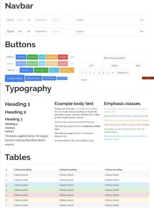
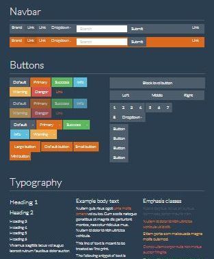
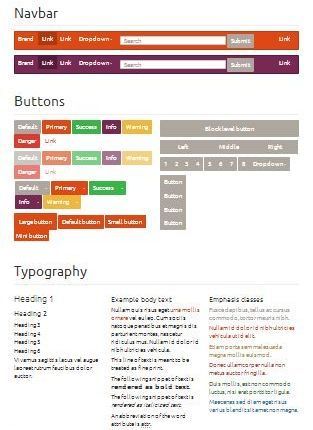
Themes (vastly different appearances)
Change one "Theme" file to completely change the look of the site! More themes can be viewed at Bootswatch There are sample themes I found interesting in the Dropdown Menu in the Navbar at the top of this page.
"Flatly" Theme
In almost every case, I find the text and headings easier to read in the Flatly (and Darkly, a "twin" theme).
The elements shown are the ones I value most. There are specific elements in other themes that I prefer to Flatly, but "readability" is #1 on my priorities.
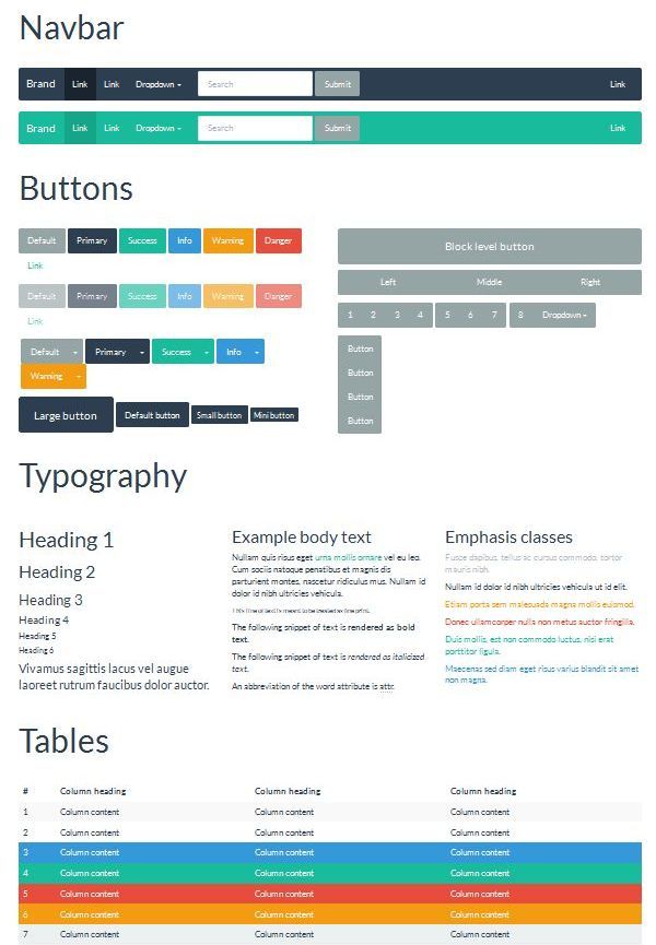
"Darkly" Theme
Identical to "Flatly", except the colors are roughly the inverse. This is my #1 favorite!
Frustration: But sometimes the default font color white doesn't work! (problem widthLL be solved!)
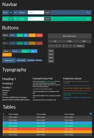
"Readable" Theme
"SuperHero" Theme
"United" Theme
Readability is Job # 1
My initial Theme choice was "United." But I kept noticing some items were hard to read. I tried Theme "Flatly". So I did a comparison.
Flatly's default font is clearly easier to read...
...although not as effective against some background colors.
Win some, lose some!
Digging deeper...
After discarding "United", I compared "Flatly" to "Readable" (and ten others) in detail. "Readable - now there is a promising name for someone who values readability!
So what is the font? The first entry in the CSS "font family" for the Flatly Theme was "Lato". "Never heard of it!" Google to the rescue, in more ways than one. Quoted directly from the "Google Fonts" "Lato" page:
Lukasz Dziedzic
SIL Open Font License, 1.1
Lato is a sans serif typeface family started in the summer of 2010 by Warsaw-based designer Lukasz Dziedzic ("Lato" means "Summer" in Polish). In December 2010 the Lato family was published under the Open Font License by his foundry tyPoland, with support from Google.
Thanks, Lukasz!
I added boxes to highlight two significant areas. Both samples are 422px high (bigger fonts use more space).
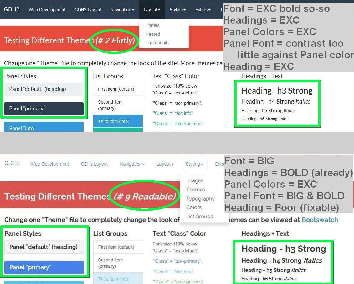
Conclusion:
"Readable" is easier to read, but it's like one of those "Large Print" novels - it's too much, it's distracting unless your vision requires it. "Flatly" has a better font and it does not overuse "bold." The winner is "Flatly"!
Typography
Heading - h1
Heading - h2
Heading - h3 Strong
Heading - h4 Strong Italics
Heading - h5 Strong Italics
Heading - h6 Strong Italics
200% StrongTypography 123 &%@#
180% StrongTypography 123 &%@#
160% StrongTypography 123 &%@# - Italics
140% StrongTypography 123 &%@# - Italics
120% StrongTypography 123 &%@# - Italics
110% StrongTypography 123 &%@# - Italics
105% StrongTypography 123 &%@# - Italics
"default" StrongTypography 123 &%@# - Italics
"Style Classes" for Text and Background Color
Each Bootstrap Theme can have up to 8 "Style Classes", each with a defined background color and/or font color.
In all the cases below, unless specifically noted, there are no "headings" or "paragraphs" - but the "font-size" is 110%.
Text Style Class
Font-size 110% below- Paragraph styled with class "text-muted".
- Paragraph styled with class "text-primary".
- Paragraph styled with class "text-info".
- Paragraph styled with class "text-success".
- Paragraph styled with class "text-warning".
- Class "text-danger" (p class="text-danger")
"background-color" Style Class
Font-size 110% belowThese items are wrapped in "paragraphs" - the spacing looks better.
Text background class = "bg-default".
Text background class = "bg-primary".
Text background class = "bg-success".
Text background class = "bg-info". (p class="bg-info")
Text background class = "bg-warning".
Text background class = "bg-danger".
Panel Style Class
Panels - Technical Details
- The "body" panel is attached and is included within the color border that matches the "heading" class style.
- Each "panel" requires two DIV's -
- class="panel panel-success" (or whatever "style class")
- either (A) class="panel-heading", (B) class="panel-body", or (C) class="panel-footer"
- I.e., "heading" above has DIV 1 + DIV 2A.
- I.e., this "body" has DIV 1 + DIV 2B
- DIV 1 sets the "style class" for the panel. In all cases, the panel has a border color determined by that "style class". Witness the "body" panel to the left with a "primary" color border.
- Note I don't say "blue" border. Each Bootstrap Theme sets it's own color, so, depending on which Theme is being used, "primary" could be dark blue, light blue, royal blue, black, gray, red, or orange.
Much of the message is how the page adapts to different widths
your screen is LARGE (Desktop, Large Laptop, TV)← drag edges to change size →
Much of the message is how the page adapts to different widths
your screen is MEDIUM (Laptop, Large Tablet) ← drag edges to change size →
Much of this is how page adapts to different widths
your screen is SMALL (Small Tablet, Big Phone) ← drag edges to change size →
This is about how page adapts to different widths
your screen is X SMALL (small Phone) ← drag edges to change size →
Image Re-Sizing - Controlled, Automatic, or None
Controlled (images selected by screen size)
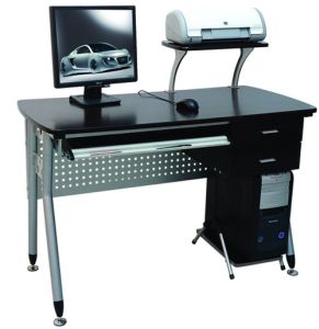
- If screen is "lg" (desktop screen, TV), make image of a desk "visible"
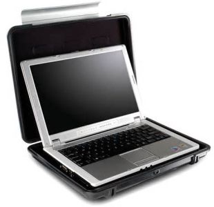
- If screen is "md" (laptop, large tablet), make image of a laptop case "visible"
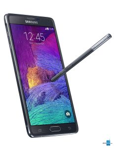
- If screen is "sm" (large phone, small tablet), make image of oversized smart phone "visible"
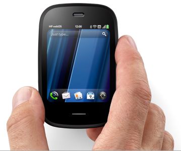
- If screen is "xs" (small phone), make image of a small phone "visible"
Need a new desk for your office?
Don't you love having a big screen?
Do you need a better case for your laptop?
Sweet laptop or tablet
Push the limits of your smart phone - ask us how?
We push technology to the limit
Small Phones are our speciality
We push technology to the limit
Automatic ("responsive" images)
The image below has the class "img-responsive" which causes the image to shrink as screen width shrinks.
Static Images (size does not change)
The next image has NO sizing rules applied. Drag the browser narrower, and the only change to the images is the right side of the image protrudes beyond the "container" and then the right end gets cropped.
Named Colors By Hue (a few)
HTML: 140 "Named Colors"
Theses are the colors that most interest me.
In all cases, the font = default size, text color = default/black/white (tweaked for good contrast)
"Reds" Arranged by Hue
Reds =LightCoral
Reds =Tomato
Reds =DeepPink
Reds =Red
Reds =Fuchsia
Reds =OrangeRed
Reds =PaleVioletRed
Reds =MediumVioletRed
Reds =IndianRed
Reds =Crimson
Reds =Brown
Reds =FireBrick
Reds =DarkRed
Reds =Maroon
"Blues" Arranged by Hue
The "purples" added complexity to sorting.
Blues = AliceBlue"
Blues = PowderBlue"
Blues = LightBlue"
Blues = LightSkyBlue"
Blues = LightSteelBlue"
Blues = SkyBlue"
Blues = CornflowerBlue"
Blues = DeepSkyBlue"
Blues = SteelBlue"
Blues = CadetBlue"
Blues = DodgerBlue"
Blues = RoyalBlue"
Blues = MediumSlateBlue"
Blues = SlateBlue"
Blues = BlueVioLet"
Blues = DarkslateBlue"
Blues = blue"
Blues = MediumBlue"
Blues = DarkBlue"
Blues = MidnightBlue"
"Yellows" Arranged by Hue
I Most "oranges" intentionally excluded.
Yellows = Beige
Yellows = LightYellow
Yellows = LightGoldenRodYellow
Yellows = LemonChiffon
Yellows = Cornsilk
Yellows = Yellow
Yellows = PaleGoldenRod
Yellows = Khaki
Yellows = GoldenRod
Yellows =Gold
Grays Arranged by Hue
Grays = LightGray"
Grays = DarkGray"
Grays =LightSlateGray"
Grays = SlateGray"
Grays = Gray"
Grays = DimGray"
Grays = DarkSlateGray"
Grays = Black"
Web Development
GDH2 Comment
I built this web site to illustrate how a single web site can be designed to work well on any size screen, from phone to desktop and as a test bed for my personal education and future reference!
This was started as everything contained on one page for pragmatic reasons, but that will change.
History
HTML (HyperText Markup Language) is a style sheet language used for describing the look and formatting of a document written in a markup language. Initial release = 1996.
CSS (Cascading Style Sheets) elements form the building blocks of all websites and allows images and object s to be embedded and can be used to create interactive forms. Initial release = 1993, encouraged by the World Wide Web Consortium (W3C) to use for style since 1999.
HTML was difficult to use, CSS was incredibly complicated. Too much code (as of this moment, this page has 1,000 lines of code and CSS could be 10X larger).
And then smart phones! Smaller screens required a completely different design. Initially, two sets of code were written for each page (a maintenance nightmare!), then CSS masters developed convoluted methods to adapt web page content for smaller screens without requiring two sets of code.
Over 50% of web traffic is Mobile!
Bootstrap
"Bootstrap" is a new web development system developed in 2011. It was updated in 2013 (bootstrap 3), "moving to a mobile first approach and using a flat design" (quoted from Wikipedia).
"Mobile First" means start the design for the XS (extra small screen, like small phones). Then adapt to larger screens.
Bootstrap offers hundreds of predefined components which can be used to assemble a web page design: navigation bar, title box, buttons, typography, tables, forms, progress bars, panels, and thumbnails. Each element can have pre-defined colors, borders, text font, etc.
Bootstrap uses CSS (Cascading Style Sheets) and generates the final HTML code for all web browsers.
Bootstrap offers 4 spectacular advantages:
- It automatically scales the format of the web page to adapt to different sized display screens.
- "Style" changes are easy - just change the Bootstrap Theme file.
- Design/maintain ONLY one web page(s)
- Modular structural elements make it easier to make significant changes.
- Note the "Problem" discussed in the next panel, GDH2 Configuration.
Better results in less time!
Page Design
Page design usually starts with a wireframe sketch that shows where different elements will be located.
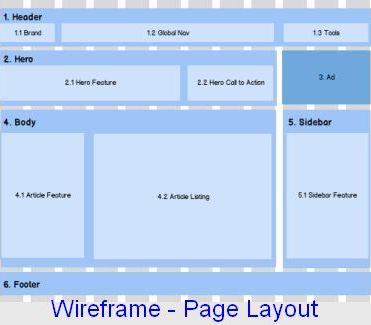
The above wireframe shows sufficient detail to predict how the blocks will be displayed on any size screen.
Gobbledygook Text
"Gobbledygook text" is used as filler in mocking up many sections. A "block" of text gives a more realistic idea of what that section might look like when it's filled with "real" content. But "real" text is distracting; most people start actually reading it, no matter what it's about.
More than 4,600 people dead. Over 9,000 injured. Eight million affected across Nepal. One million children urgently in need of help. Those are the startling numbers that indicate the scale of the devastation from the huge earthquake that struck the Himalayan nation on Saturday.
Latin makes it less distracting, usually. It's used in lots of places, like...
Lorem ipsum dolor sit amet, consectetur adipiscing elit, sed do eiusmod tempor incididunt ut labore et dolore magna aliqua. Ut enim ad minim veniam, quis nostrud exercitation ullamco laboris nisi ut aliquip ex ea commodo consequat. Duis aute irure dolor in reprehenderit in voluptate velit esse cillum dolore eu fugiat nulla pariatur.
GDH2.com Configuration (Where is everything?)
GDH2 Content
First Layout
- Intro
- Start with introduction to the changing internet users, new priorities, and new tools.
- Describe this site. A technical presentation of how Bootstrap works and its major elements.
Show Major Layout Elements - Panels, types, how they nest, and how they cluster.
- Thumbnails, which are actually pre-packaged Panels, but they warrant their own space
- Nested Rows/Columns is essential to web page design, but how it adapts to tiny screens is new.
Show Menus and Navigation - "Navbar" describes the top of the page and shows the crucial advantage of Bootstrap for small screens. Logical for topic #1 after the intro, but too technical to start?
- List Groups bridge Layout (they are almost mini Panels) and Menus (very often used as links).
- Dropdown menus, icons, and buttons
Present Styling Issues - "Themes" are a key design element. The choice of Theme determines colors, font family, font sizes, etc.
- Typography is absolutely essential in good websites. Also discussed in "Themes".
- Image resizing is complicated and deserves good examples.
- "Color Hues" - odd info, but I find it useful.
UGH! Too may words at top. MORE PIZAZZ! Moved top two panels to bottom (2 minutes) and added new Panel with graphic showing "website works on any screen."
Content Not On GDH2.com Main Page
- Themes: There are several examples that can be linked to from a dropdown menu in the top Navbar. Each example uses the identical web page, specifically designed to illustrate the most salient design elements of a Theme.
- Carousel: It seemed too distracting to include in this page.
- Accordion and Scrollply: Best shown on a smaller page.
- Tabs: It looks more impressive when it's shown in a less confusing context.
- Images: There is another web page showing some more details, including "float" and "padding."
Problem
Too many topics on one page - 15 desktop screens deep! Easy to get lost. Could I add column on left containing a "page directory" with links?
Bootstrap to the rescue!
Technical description; (don't bother unless you're curious)
- Create a Container after the top Navigation Bar and end it above the bottom two Panels ("Page Links" and "Footnote")
- Create a Panel #1 (indent 1)
- Create a Row #1 (indent 2)
- Create a Column #1 (1/12 of available width) (indent 3)
- Insert Links to this page and close Column #1 (indent 4)
- Create a Column #2 (11/12 of available width) (indent 3)
- Create Panel #2 so there is padding (indent 4)
- 1200 lines of code, 15 sections (most Panels), which needs to be mass indented from starting at indent 1 to 5 (indent 5)
- Close Panel #2, Column #2, Row #1, Panel #1, and Container (which contains all but the Navbar at the top and 2 Panels of the bottom of this page)
- Time: under two hours!
- Technical: (1) Containers of enclosed panels had to be removed. (2) Screens LG + MD need 16 sets of links, SM 12 more, XS 13 more (longer screen).
Full width design. Looks good.
Links on left design. Works better. Looks good (maybe better?). The "content" is squeezed 9% (1/12 of screen width).
Author
Copyright 2015 by G. Douglas Hobkirk II (GDH2)
Acton, Massachusetts, USA
original GDH2.com design for 15 years (only used for email)